Thursday 26 June 2014

SURPRISE


Look at what I've have secretly been up to! I am so excited to announce that Pause is moving to a new site called simply pause ! Same writer/photographer, similar content, just a fresh new look, some fresh energy and a much simpler, more professional, beautiful site. 

Pop over! It'd be good to see you!

Sunday 22 June 2014

Basic Indulgence

Every photo tells a story. 

There was almost no post this week. But I'd secretly promised myself to post something every week. Hmmm. So. Well. Basically, I'd been reading my food photography book, and she keeps reminding me to find the story behind every image I create. "There's always a story", she says. When you know the story that lies behind your image, then choosing lighting and colour and props and angles and composition, becomes so much simpler.

So there I was, feeling sorry for myself when... I saw a story I had to tell.

Enjoy!


Friday 13 June 2014

Back to Basics - Tomato Love


 I had these tomatoes sitting in my windowsill and every time I wanted to use one, I found myself reaching for some other tomatoes from a different bowl. These just looked too beautiful! Subconsciously, I was saving them for a photo. So eventually, I gave in and stole a little time to photograph them. They were just too photogenic to ignore.

Tomatoes are a real basic in our home. They're always on our shopping list. Normally they go straight into a blue bowl in my kitchen windowsill, where they're meant to slowly ripen, deepening in colour and flavour - but they tend to get eaten first!


I use a variety of types and really believe the more the merrier - cherry, plum and of course tinned tomatoes! In salads, I'm the one who fishes out all the tomatoes and adds one or two salad leaves to my plate for decoration. And for the cherry on top of a fry up - the best thing is little helping of fried cherry tomatoes - cooked with balsamic vinegar until they pop.
Pasta? with cherry tomatoes roasted in the oven with olive oil, served with fresh basil and maybe some feta cheese or pesto? Perfect. What would boerewors* be without fried onion and tomato mush, served in a fresh white roll? And curry without tomatoes sambals?
And in winter, my friend makes the most divine Lamb stew, slowly cooked in tinned tomatoes. (Now I'm drooling!)

The more I think about it, tomatoes really are a basic necessity in our home! So this is a little ode to tomatoes, cooked, fried or a just a sweet, fresh little plum tomato popped into your mouth...

What's your basic? I have a friend who always has cream in her fridge and then some people cannot do without cheese... Love to hear from you, in the comments below!


(* boerewors is a South African beef sausage, made with a mix of spices, usually includes coriander)

Wednesday 4 June 2014

Back to Basics - improve your photography in 2 simple steps

Can you believe it's already June? We've had a lot of visitors recently and we've been busy busy busy. Time's flying and it's not always easy keeping up. When it gets like this, I find the best way to cope is to simplify everything. Find the essentials and just let go of the rest.

So I'm on this mission to go back to basics. 
(In my blog, back to basics has gone to some extremes, which I'll be sharing with you soon...)

In photography, the best back to basics tips that I can give are to:
1) simplify what's in your image 
2) simplify your light source

To simplify what's in your image, find an angle that cuts out the background. Go in really close or turn your subject around to include as little clutter as possible, in the background. A wonderful trick, if you're photographing children, is to go in slightly from below and use the blue sky as a backdrop. The opposite is to get them to lie on the ground, you stand on a chair and use the lawn as your background. In that way you simplify everything in your shots and the main subject really stands out.

The other way is to simplify your light source. If you're outside, that's quite simple - the sun or overcast sky is your single main light source. Inside can be a little trickier, so simplify.  Switch off your house lights and try using natural light. Choose one window as your single light source. Try taking your shots with the main light source to the side of your subject. That way your image will have a balance of light and shadow. 

Here's a quick and basic photo challenge:

Get your child to sit in chair that you've moved near the window or glass door. Now you squeeze up right up to the window, so that the light source is coming from the side, but you're seeing the slightly more of the lighter side of them. Switch off your flash. Get them to show you the latest Lego toy they built and tell you about it. They don't have to smile, just sit and chat to them and click away. 

Simplify and I can guarantee you'll get some good shots.

The Country Quiche 


I simplified here. I went back to basics. No props or background. One light source from the top left corner. And a simple, wholesome, country quiche.

I got good highlights on the pastry and the cheesy surface, but enough colour to make you drool.  The whole image is light and airy like the Quiche. Yum! The Recipe is in the post below...


Basic Country Quiche - The Recipe


I know you're going to ask so here it is. And yes, it does taste as good as it looks!
If you have the basics in the fridge, you can add almost anything to it to, and turn it into something awesome. Serve with a simple salad, or for you wintery lot - add some steamed veggies.

Basics:
One large sheet of shop-bought, pre-made pastry
6 eggs
2 large dollops of creme fraiche (No creme fraiche? try full cream Greek Yoghurt?)
300-400g grated cheese
bacon bits

Veggies of choice:
In the photo above, I used dollops of creamed spinach and grated carrot, another time there was broccoli in the fridge, but my favourite was chopped leek and mushroom.

Got the stuff, now what do I do?
Pre-heat the oven to 180 degrees and grease a shallow dish. (This one is about 30cm in diameter)
Place the dish on the pastry and cut the pastry a little larger to cover the base and go up the sides.
Line the dish with pastry.
Cut the remaining pastry into thin long strips. 

Place the bacon bits and a half the cheese on the pastry.
Lightly fry or steam your veggies of choice and add as the next layer, leaving gaps for the egg to fill later.
Beat the eggs and creme fraiche and pour over veggies.
Cover with the remaining cheese.
Place the strips of pastry over the top in a criss-cross manner and paint over them lightly with a little egg.

Bake for 30-40 minutes (depending on the ingredients and your oven)
You can prepare the salad and set the table in the meantime

Serves 4 

Enjoy!


Tuesday 27 May 2014

Are you a Clickin Mom?


If you're a mom and a photographer, striving to capture the fleeting moments of your children's childhood I must urge you to just have a look at this site if you're ready to grow and learn.

Clickin' Moms


Most Photography sites and magazines are aimed straight at men. The layout, the jargon the whole atmosphere is quite emotionless, technical and in-your-face bold. Now, us visual people realise when something as visual as a magazine or website design isn't aimed at us and doesn't make our spirit hum! Don't we? Photography is not just a science after all. Yet there are millions of photographers out there like you and I, who for many years have been left out of the loop.

Recently that has started to change and this is one of those sites that'll make you ooh and aah about the possiblities of photography, for hobbiests and professionals with their own beautiful feminine touch.

Clickin' Moms actually just has too much information. You will continually learn on the site, no matter what your level. Here's a little guide to let you know what's on there.

Where do we start?

The Blog: Interviews with a range of photographers, from hobbiests to professionals, with detailed tips and personal information written in female language. And with stunning examples of their work. You could start by subscribing to the newsletter and have highlights from the blog sent to your inbox.

Free Tutorials:  From the very basics to more complicated concepts are covered here. They're topics that really apply to us.
Topics like:
"8 Tips for Photographing unco-operative children"
"Ask the pros what gear do you want for Mothers day?"
"5 Tips to taking photos from the passenger seat"...

Browse through them and pick anything you want to know more about.

cmuniversity  These are paid on-line courses on a variety of subjects from technical stuff, to personal work, to fine art photography. I haven't done any of these courses, so I can't comment on them, but the range that they cover is sure to inspire you. Many courses offer different prices for full participation or not. I think there's really something there for everybody.

Forums: For this section one needs to subscribe to the website. If you go there now, you'll see the topics but not the information. This put me off at first, but I decided to give it a try and it's great! What I am able to do, is go to the food photography section, upload my food photo and get positive constructive feedback. And in return I can have a look at what others have been doing and give my advice and support. There are also forums that challenge you to extend yourself, by taking a photo a week or a daily challenge, with themes to get your photographic mind ticking. Some forums ask for criticism, while others are crit-free forums. You can post questions about techniques or equipment and you'll get good logical understandable feedback. Because you need to subscribe to the forums, only members get to comment and interact with you here and you get very supportive advice, from lovely fellow female photographers. At the moment they're running a free 30 day trial period, which I would really like to recommend to you, if you have some time and would like to grow photographically.

Magazine: For Christmas, I convinced my husband to buy me the magazine subscription, which is pricey if you live outside the USA, but when it pops through my door I get so excited! It's filled with beautiful images and photographic inspiration and advice for the PHOTOGRAP(HER) as they say, and I'm able to hold and keep all that info in print! It's MINE!

So next time you have some time to browse on the web, push Pinterest aside and have a peak into Clickin' Moms, you might just find yourself inspired!

Clickin' Moms

(PS I'm not being paid advertising fees here, if you decide to join Clickin Moms and use the link above to get there, I might get paid a few ridiculous cents, but you can just go directly to the site too. That's not why I posted this. I know of a couple of photographers out there who are dying to grow, but don't know what they're looking for or need. I hope you'll find what you need there. I honestly think Clickin Moms has helped me to see photography in a new way and I just love promoting feminine photography! It's time the world sees things through different eyes!)

Friday 23 May 2014

Light


It's drizzling outside. The beautiful bright happy light of the last couple of days has disappeared again and it's replaced, with soft gentle quiet light. Shhhhhh....
My book arrived!!! And I'm devouring it! Some bits I've been able to skim, but even the stuff I know is written about in such a clear yet sensitive way, that it's like learning it all anew. At the moment I'm reading about light, and how every type of light has something different to offer. There is no such thing as "bad" light. Coming from Johannesburg, where the light is generally so strong, this is a gentle reminder to me to keep looking for that literal silver lining, which she says you only really find on dark rainy days.
Photography is really all about capturing light. The light you choose sends the most subtle messages across to your viewer. Generally they don't even notice it. It's like an added secret language you use. You can have the most amazing image, but if the lighting is wrong it's all just wrong (and it can't be fixed in photoshop). 
This week I was photographing handbags for a small, newly fledged company that sells custom-designed handbags. We only did the straightforward shots on plain white background, but I knew that the way I chose to light the bags would be the essence that would tell you about the quality - subtle and not simple at all.
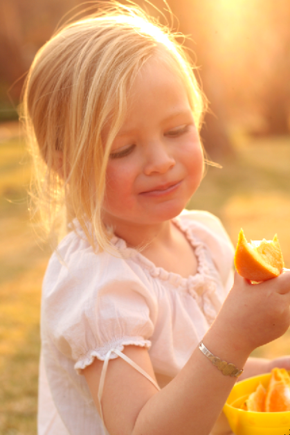
Other times light is not subtle. This image is ALL about light, you can feel it all around her, flooding the picture with warmth.
Image

So today I thought I'd just remind you to look out for light. Even on the gloomy days, see how it lingers delicately on the edge of your coffee cup? See how it gently traces over your child's face as they sit at the window? 
When you're choosing an image to photograph, draw, paint, don't forget to ask yourself what is the light saying? If I looked at it from a different angle, how would the light change? Look at the shape of the silhouette, or the highlighted edges... switch off the flash of your camera and see what happens.
See! Enjoy! Play!